.jpg)
.jpg)
My Role
Branding Design
Motion Graphics
Art Direction
Motion Graphics
Art Direction
Team
Sagdiana Rakhimova
Lois Choi
Mia Koszalka
Lois Choi
Mia Koszalka
Tools
Figma
After Effects
Illustrator
Photoshop
After Effects
Illustrator
Photoshop
Duration
4 Months
Project Overview
Redefine South Korea’s global image by addressing the perception gap between its modern, urban identity and its rich cultural heritage. The goal is to attract a wider range of travelers seeking a more diverse and authentic experience.
Problem
Despite global fame for K-pop and tech, many travelers have a limited view of South Korea, focusing only on its modern, urban side and overlooking its rich history, nature, and culture. This can turn away travelers looking for a broader experience.
Solution
Branding showcasing South Korea’s rich history, nature, and culture alongside its modern achievements, offering a more diverse and authentic experience to attract a wider range of travelers.
01
Brand Profile
Defining A Fresh Identity
Brand Positioning
South Korea offers travelers a unique blend of modern innovation and rich cultural heritage, inviting exploration of its vibrant traditions, natural beauty, and contemporary achievements for a truly diverse and authentic experience
Design Principle
Blend discovery with authenticity and encourage exploration of lesser known aspects of Korea. Genuine cultural experiences, rich traditions, and natural beauty create narratives of modernity with heritage.
70% Explorer
.png)
30% Creator
.png)
02
Brand Identity System
Flexible Branding for Cultural Versatility
Primary Logo
Inspired by the shapes and forms of Hangul characters.
The letter "O" is resembles the Taegeuk symbol from the Korean flag.
Structural Analysis
Each letter maintains the same width.

Secondary Lockup
A modified version of the primary logo, designed for more vertical layouts where the primary logo may not be suitable.
.png)
Secondary Logo
A simplified version of the primary logo, for applications where the full logo may not be suitable.
.png)
Logo Mark
Used at its minimum size when the usage requires it to be extremely small, both on screen and in print.

Dynamic System
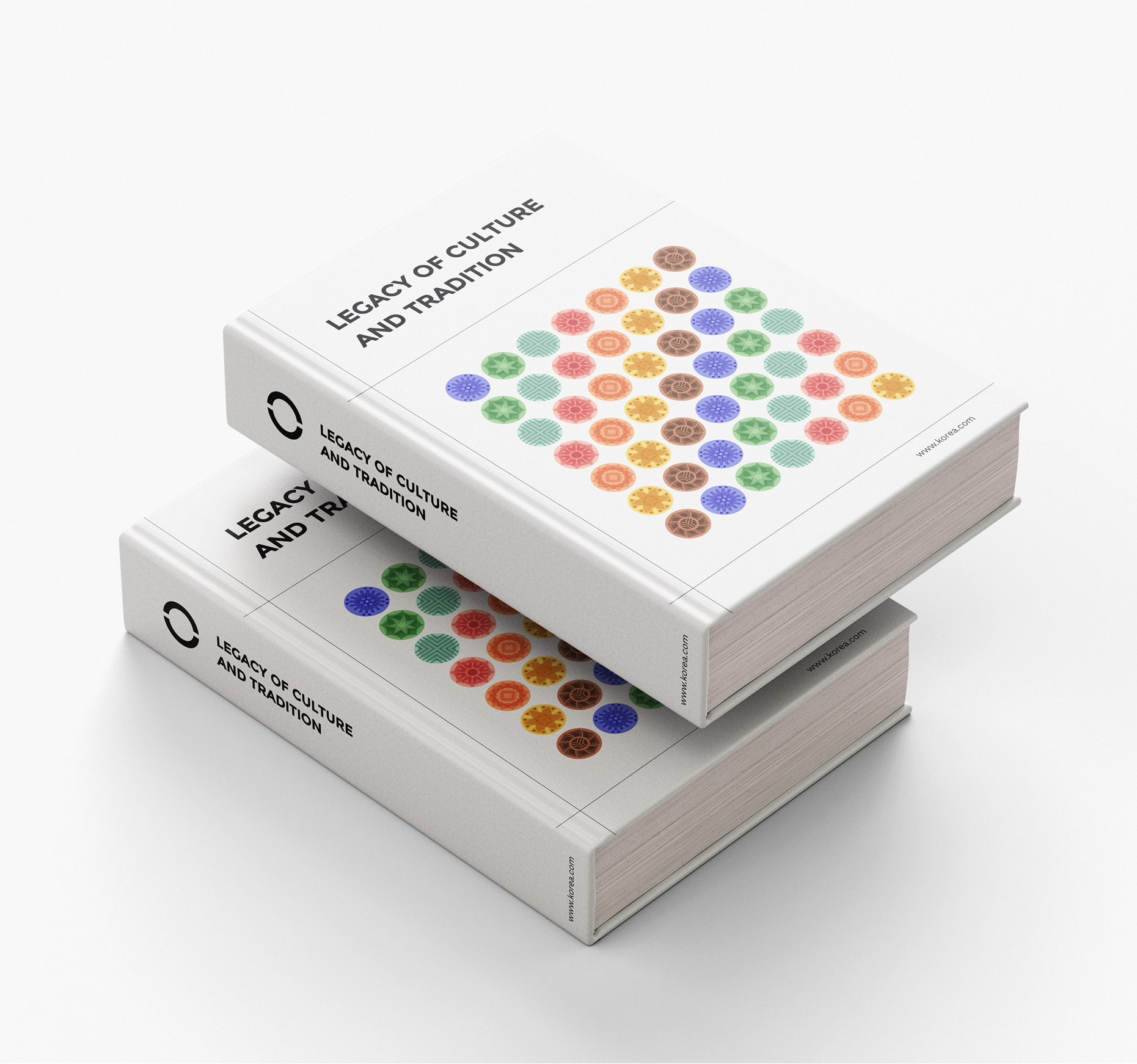
Inspired by Korea's traditional clothing, Hanbok, this design is an abstract interpretation of symbols representing various aspects of Korean culture.

Brand Typeface
NATS
A - Z, Regular
ABCDEFGHIJKLMÑÖPORSTÚVWXYZ
abcdefghijklmnoparstuvwxyzäädenñodé
abcdefghijklmnoparstuvwxyzäädenñodé
Digits, Regular
1234567890

Kantumruy Pro
A - Z, Regular
ABCDEFGHIJKLMÑÖPORSTÚVWXYZ
abcdefghijklmnoparstuvwxyzäädenñodé
abcdefghijklmnoparstuvwxyzäädenñodé
Digits, Regular
1234567890
.jpg)
Brand Colors
The colors are inspired by Dancheong, the traditional Korean decorative coloring on wooden buildings and artifacts.
Cornflower
hex #94a4fd
Periwinkle
HEX #757FE8
Royal
hex #1811a8
Fern
HEX #8FCB83
Jade
HEX #71B16A
evergreen
HEX #18641D
seafoam
HEX #B5E6D3
mint
hex #8DC2AD
sage
hex #427F67
peach
HEX #FFB2A0
coral
HEX #E6645C
scarlet
hex #CE1A1C
Sherbert
HEX #FFAA74
Sunset
HEX #f17b4b
tawny
hex #E1481E
lemon
hex #CB5F00
honey
hex #EDAF42
Saffron
hex #CB5F00
Terracotta
HEX #C87D5B
Chestnut
HEX #804A31
Clove
hex #572E1A
.png)
Look At Full Brand Style Guide
Brand Style Guide >
.png)
03
Application
Korea's Travel Campaign
.jpg)
.jpg)


.jpg)


.jpg)
.jpg)
.jpg)
.jpg)
.jpg)
.jpg)

04
Reflections
Highlighting Korea's Diverse Culture
01
Expanded South Korea's identity with a dynamic system that highlights its cultural diversity, ensuring the brand stays relevant and engaging through an adaptable design.
02
Blends South Korea’s popular culture with its traditional culture, while promoting diverse destinations beyond the city to promote a more authentic travel experience.
03
Implemented the new branding across multiple platforms, refreshing digital media and promotional materials for a unified presence that enhances recognition.
Explore My Other Projects :D
Thanks For Checking Out :)
linkedin.com/sagu
.jpg)

.jpg)